JCA Event Branding – Grow
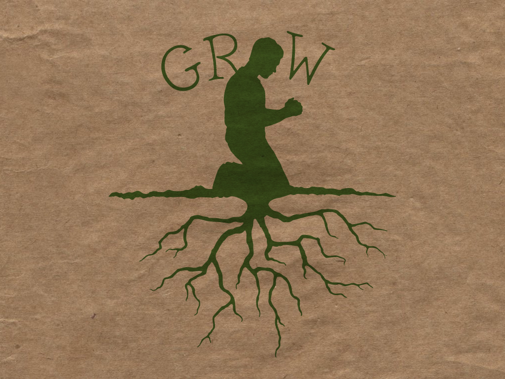
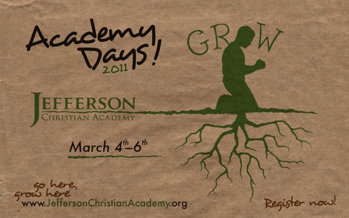
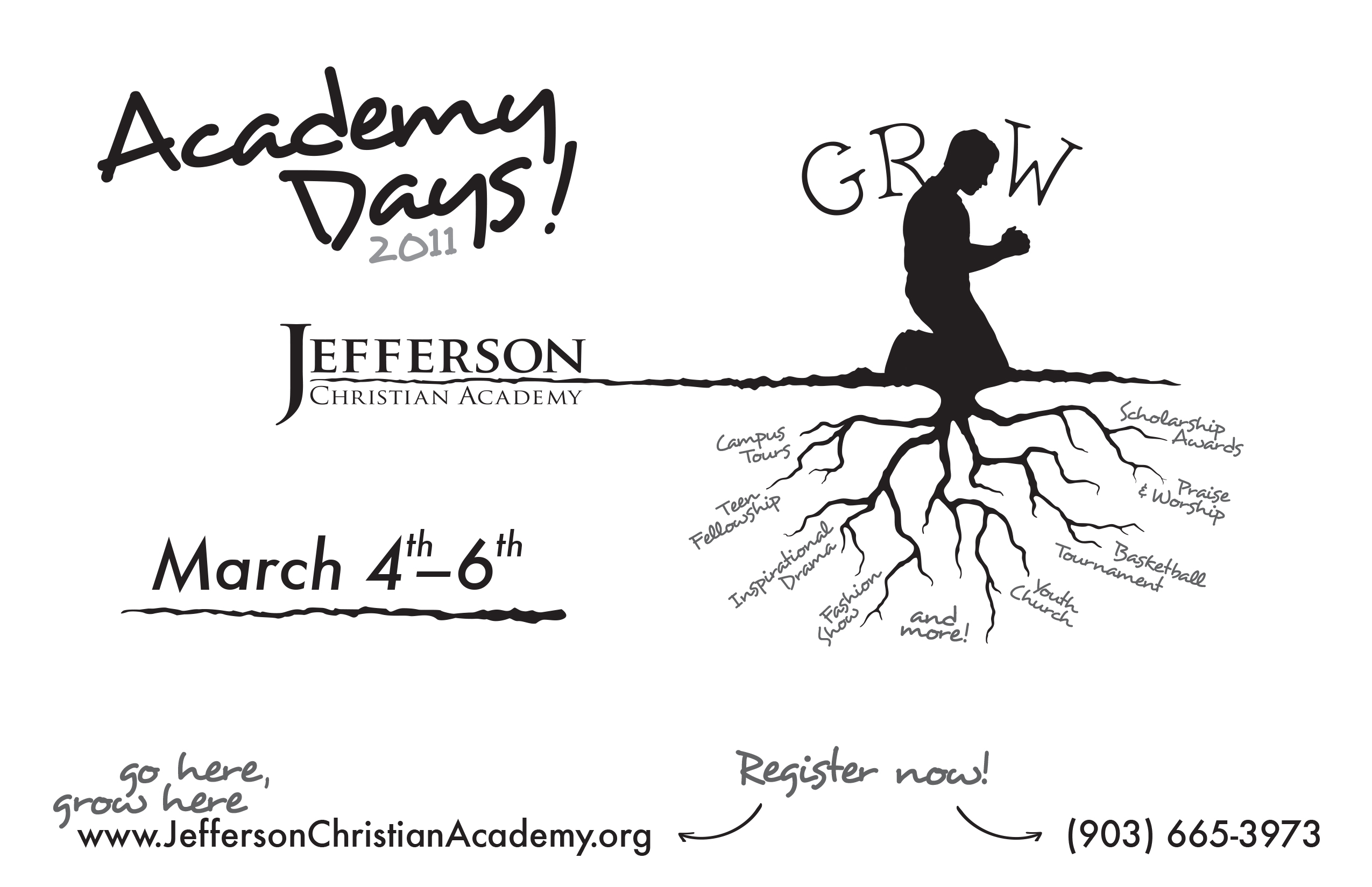
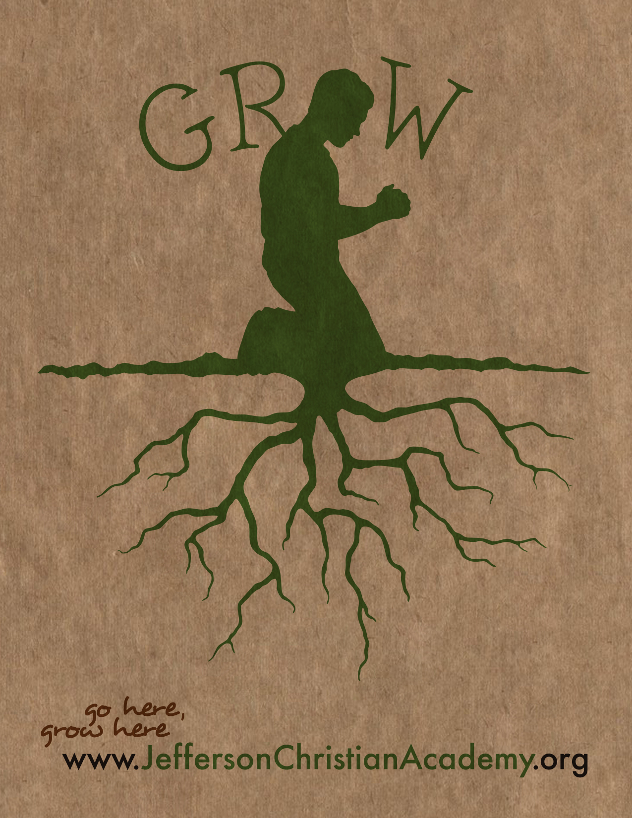
This design was based on the idea that being firmly grounded with solid tradition roots helps develop a strong character. All of the activities and programs for the weekend were based around plant and soil metaphors, and I directed the student drama team “Good Seed” in a performance based on the parable of the sower from Matthew 13.
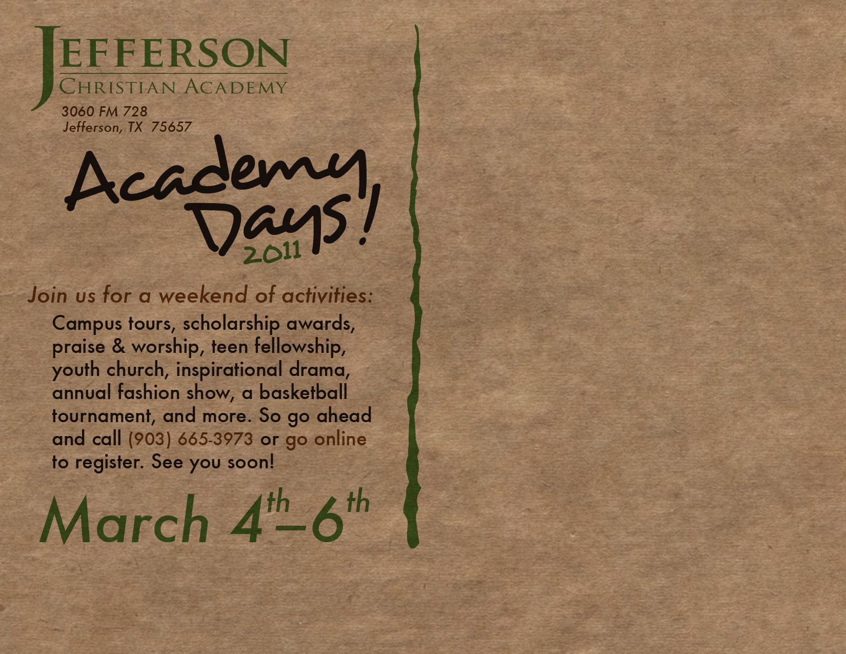
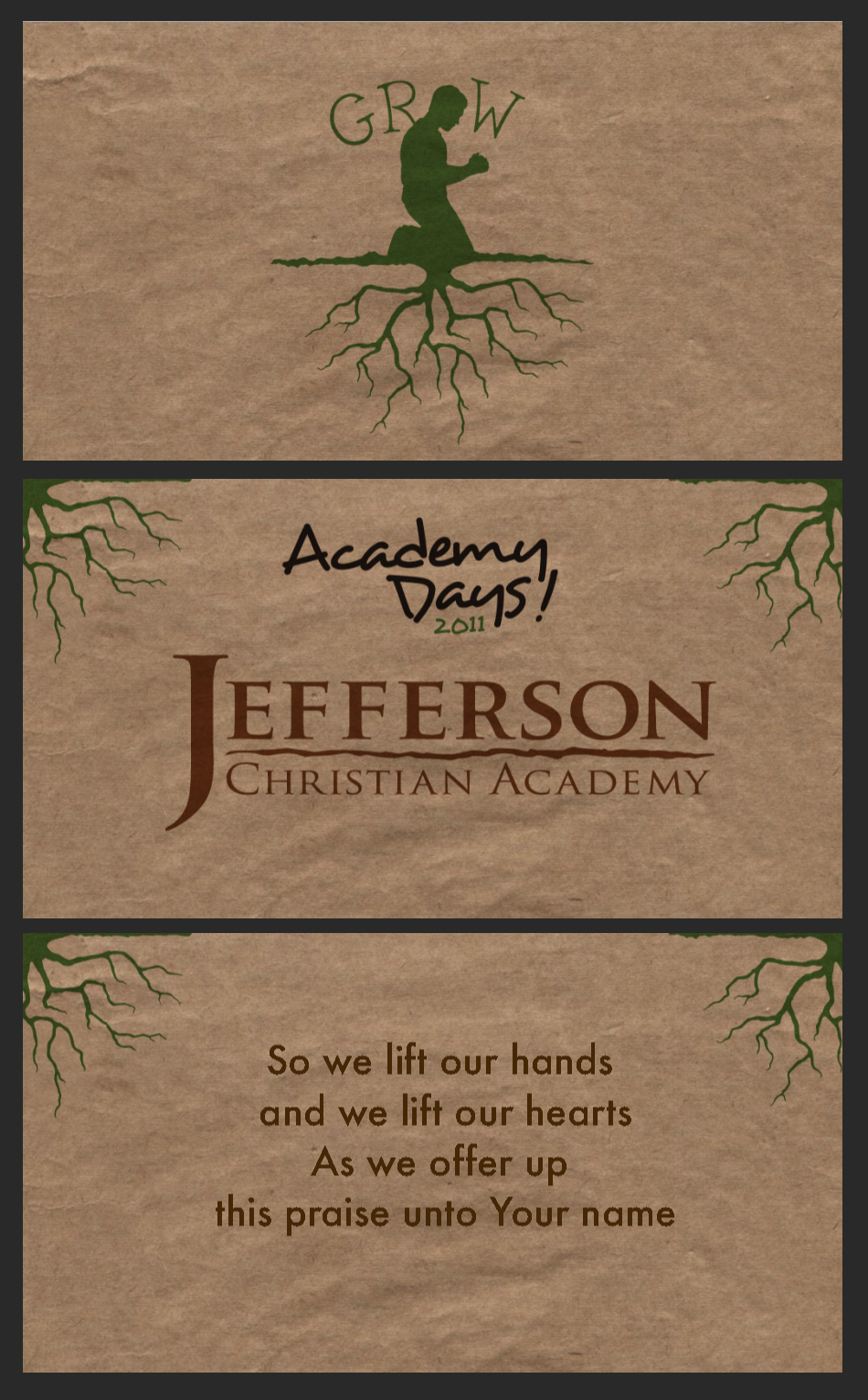
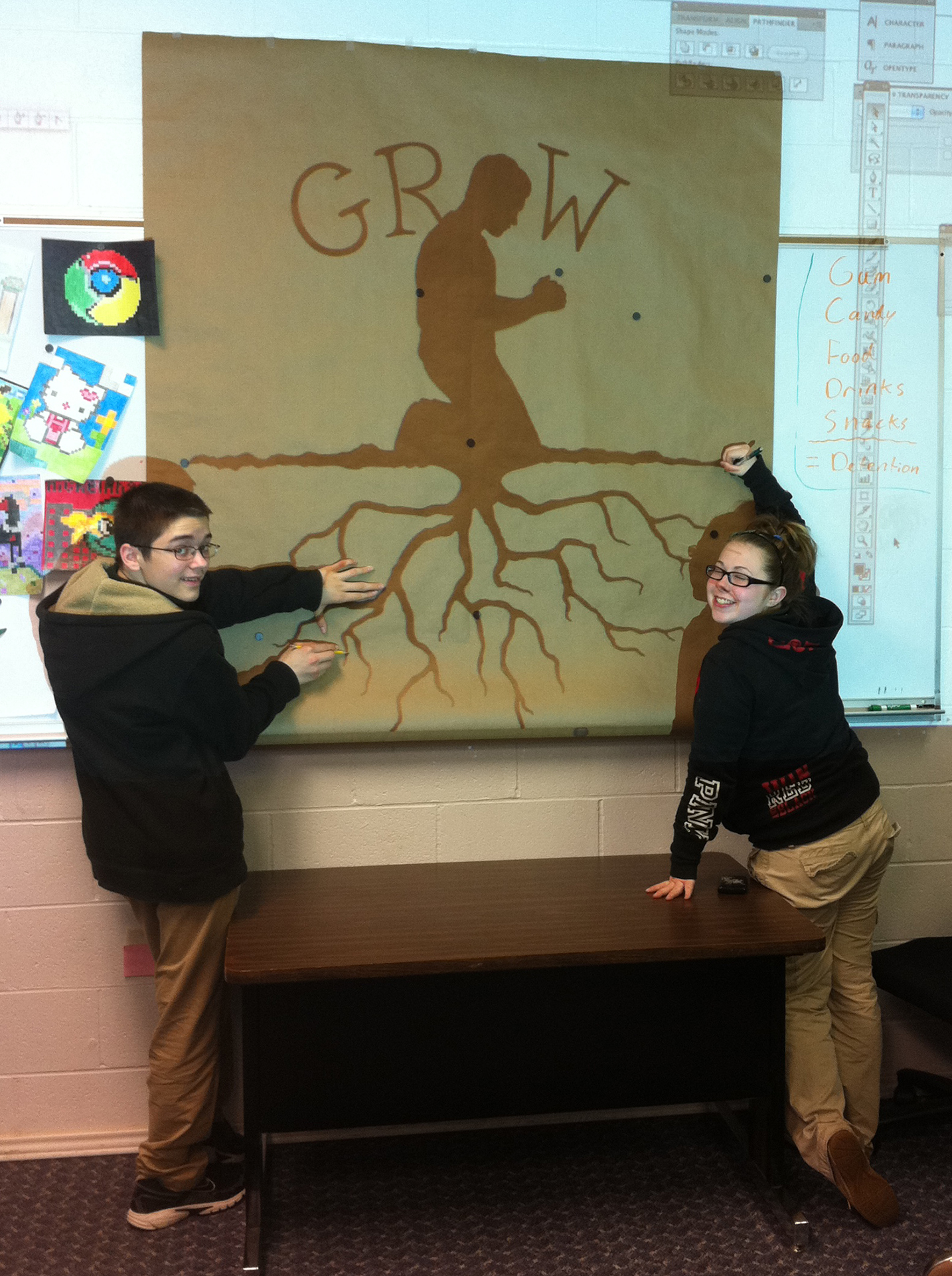
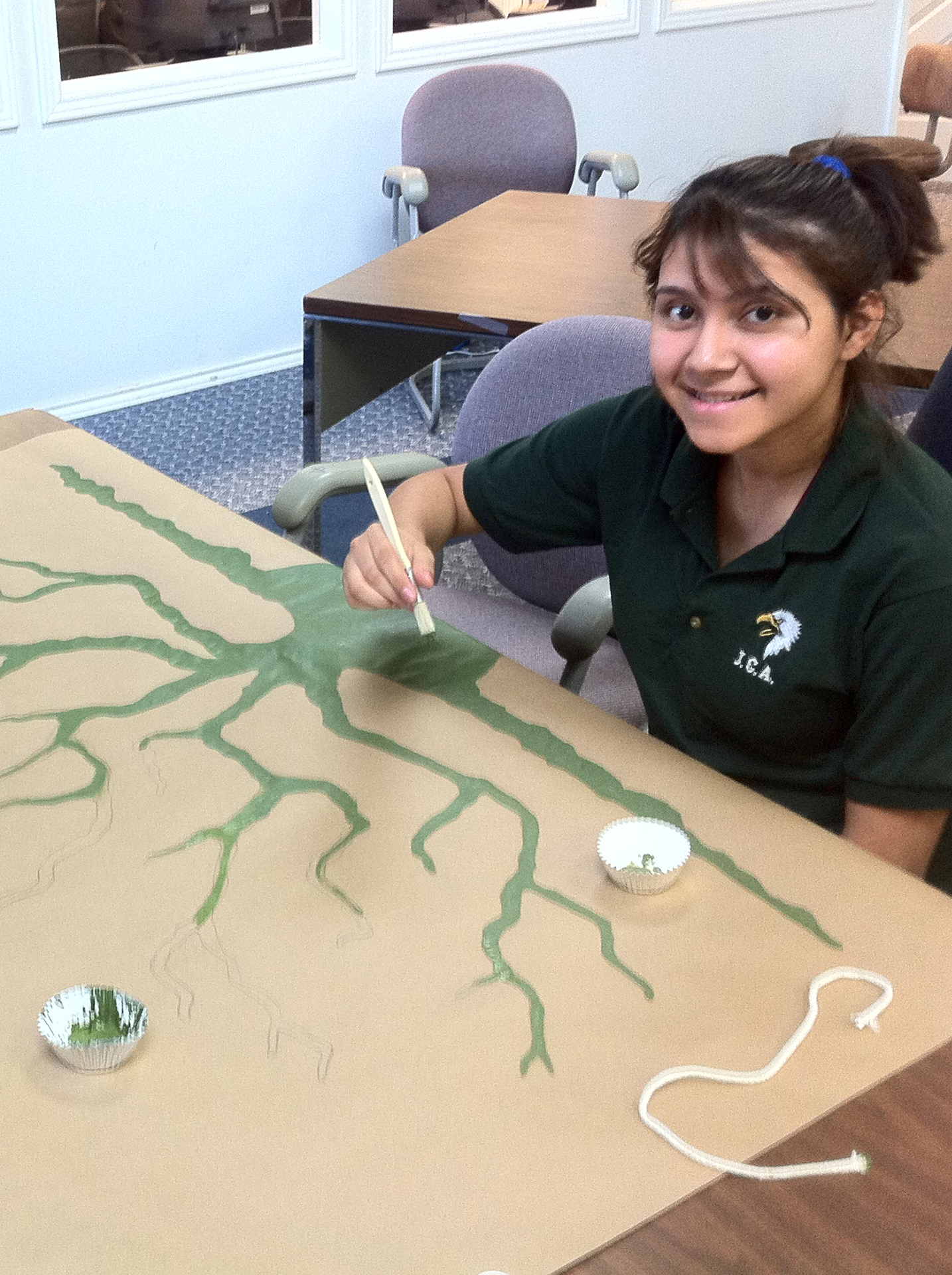
I created an invitation postcard, flyers, name tags, posters, social media graphics, and a slide deck. A large banner was hand painted by using some leftover heavy-duty brown paper normally used by painters to catch spills.
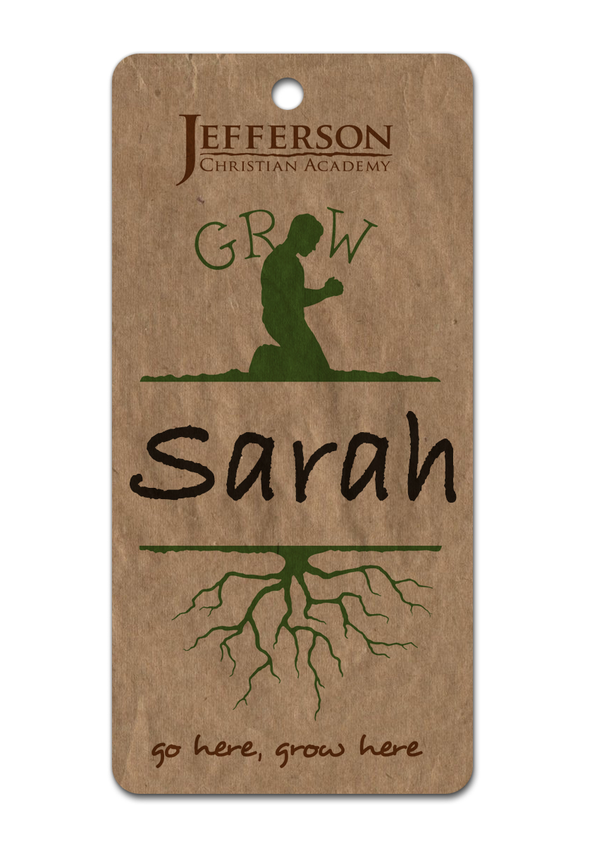
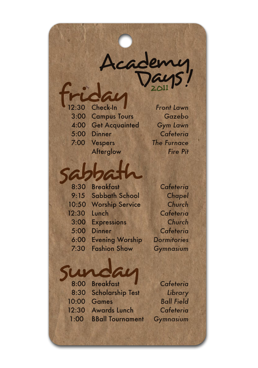
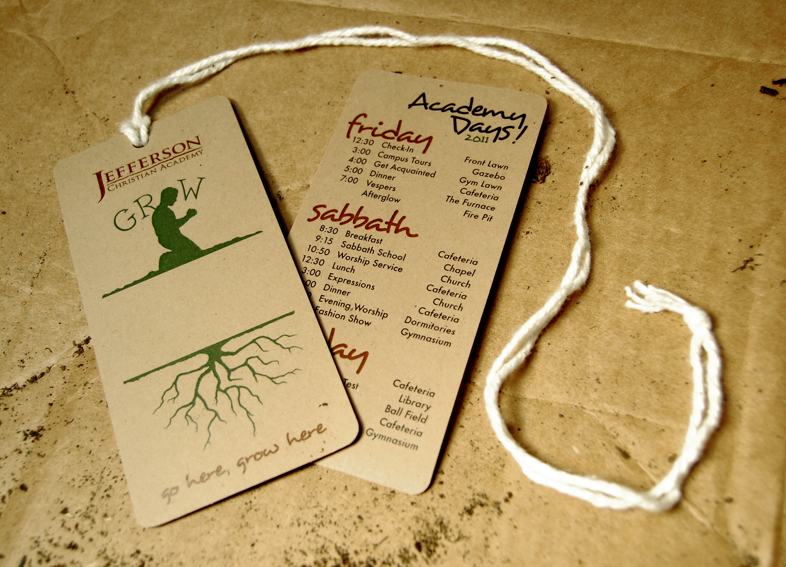
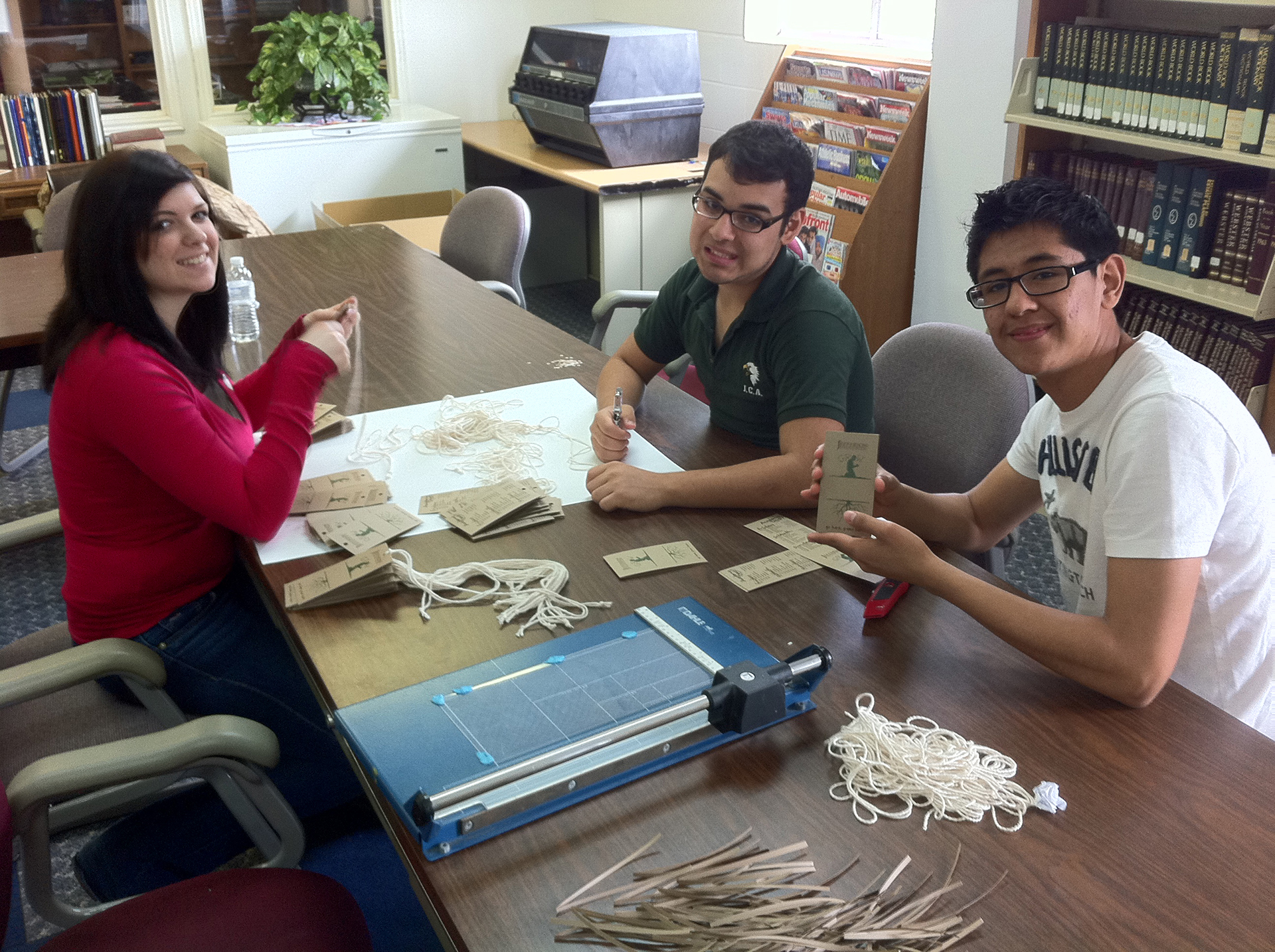
As an added convenience, the name tag lanyards doubled as a schedule. This also reduced the number of separate pieces needing to be printed. The schedule was printed upside down on the back so it would be right-side-up to the attendee when viewed from above. Everything was printed on a pack of natural fiber paper that I got from the craft store and rounded corners were punched by hand.
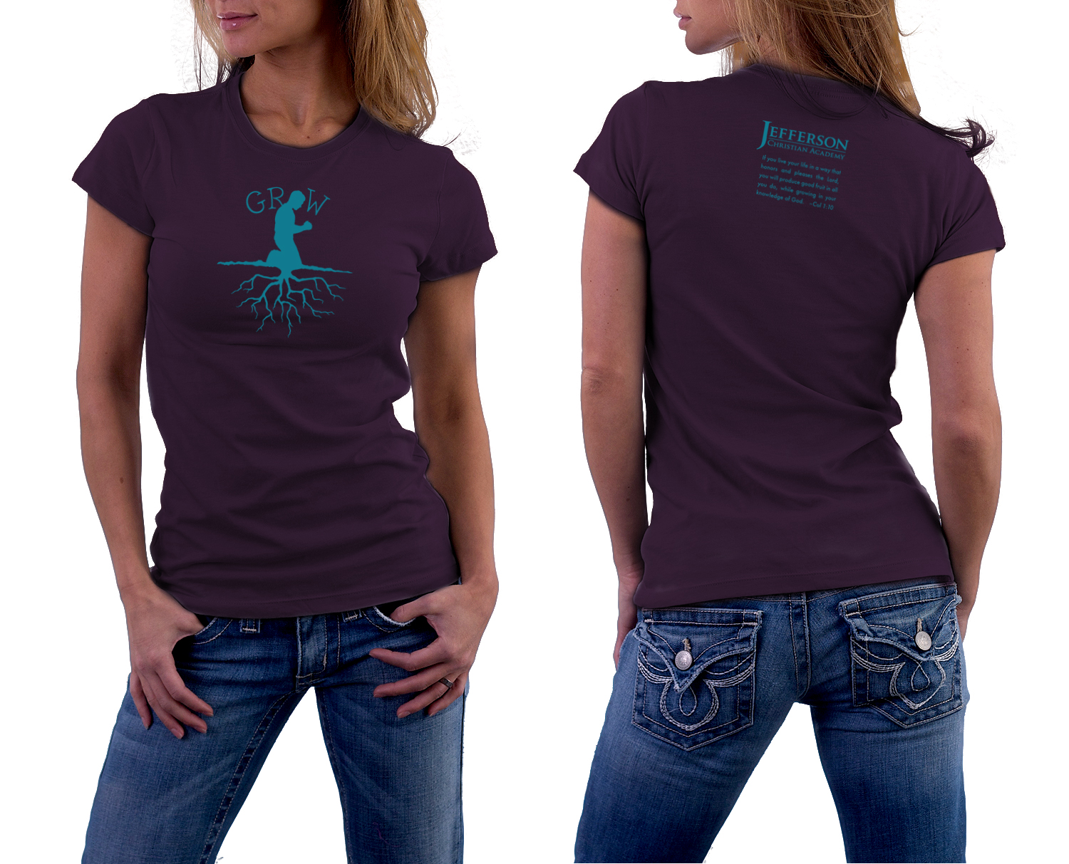
The T-shirt was able to be produced using a single screen by masking off alternating halves and shifting where the impression was placed for each side of the shirt. The bold colors made this piece a huge hit and we had so many requests to buy extra ones that we had to print a second run. This theme ended up carrying throughout the school year and a variation of this logo was even featured as the yearbook cover.
