JCA Event Branding – Chart Your Course
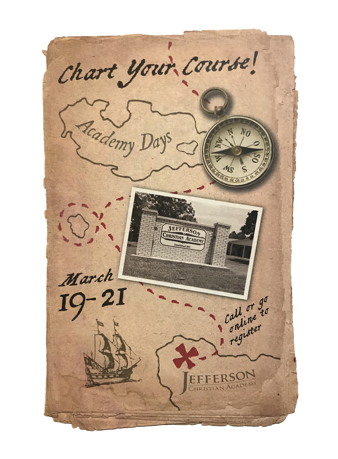
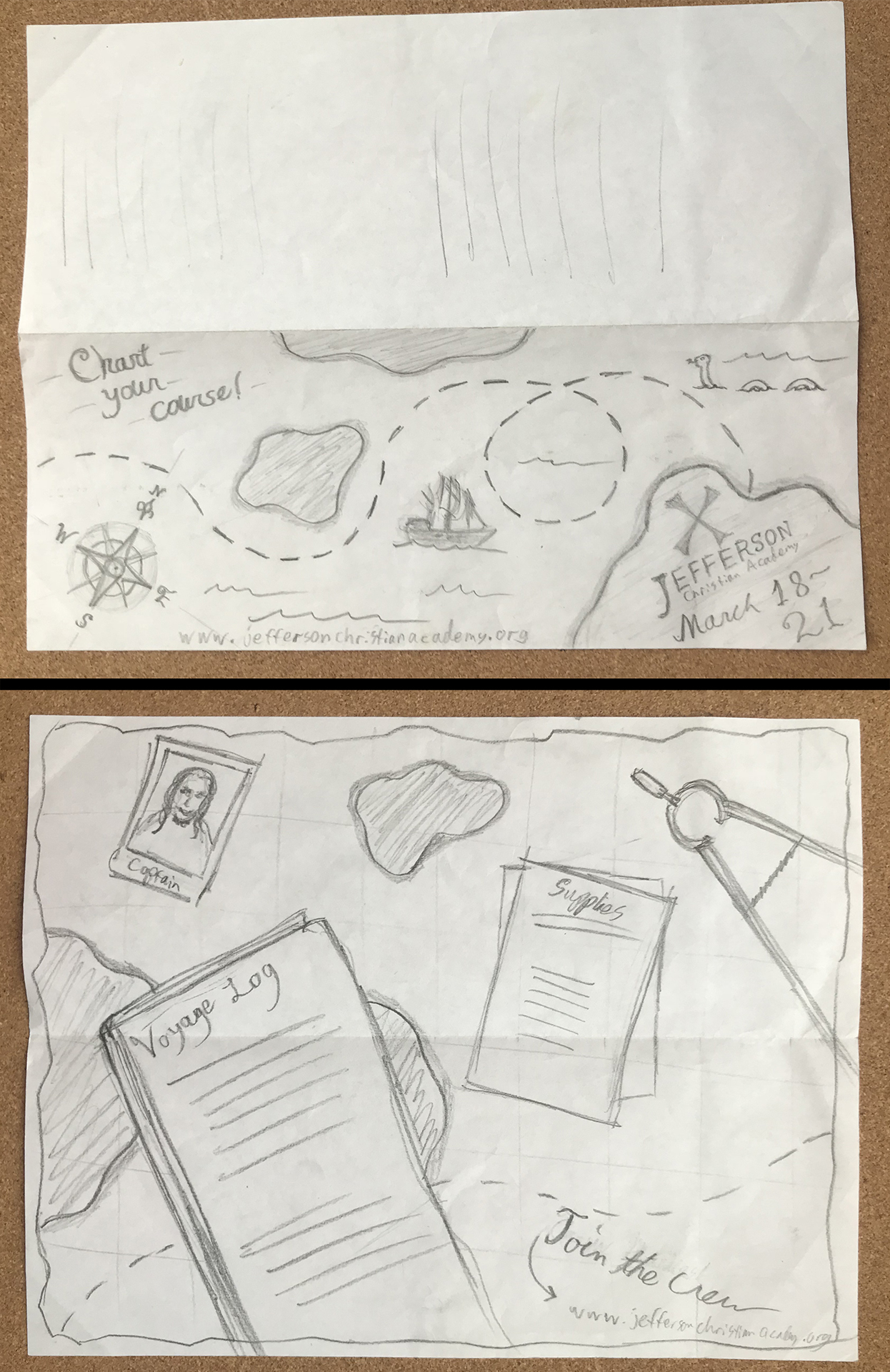
I started with a rough sketch to play with ideas, and that eventually evolved into a single sided half-page teaser flyer to establish the theme well ahead of the event. I ended up choosing a vertical format so that they could fit inside local church bulletins in the weeks leading up to the event.
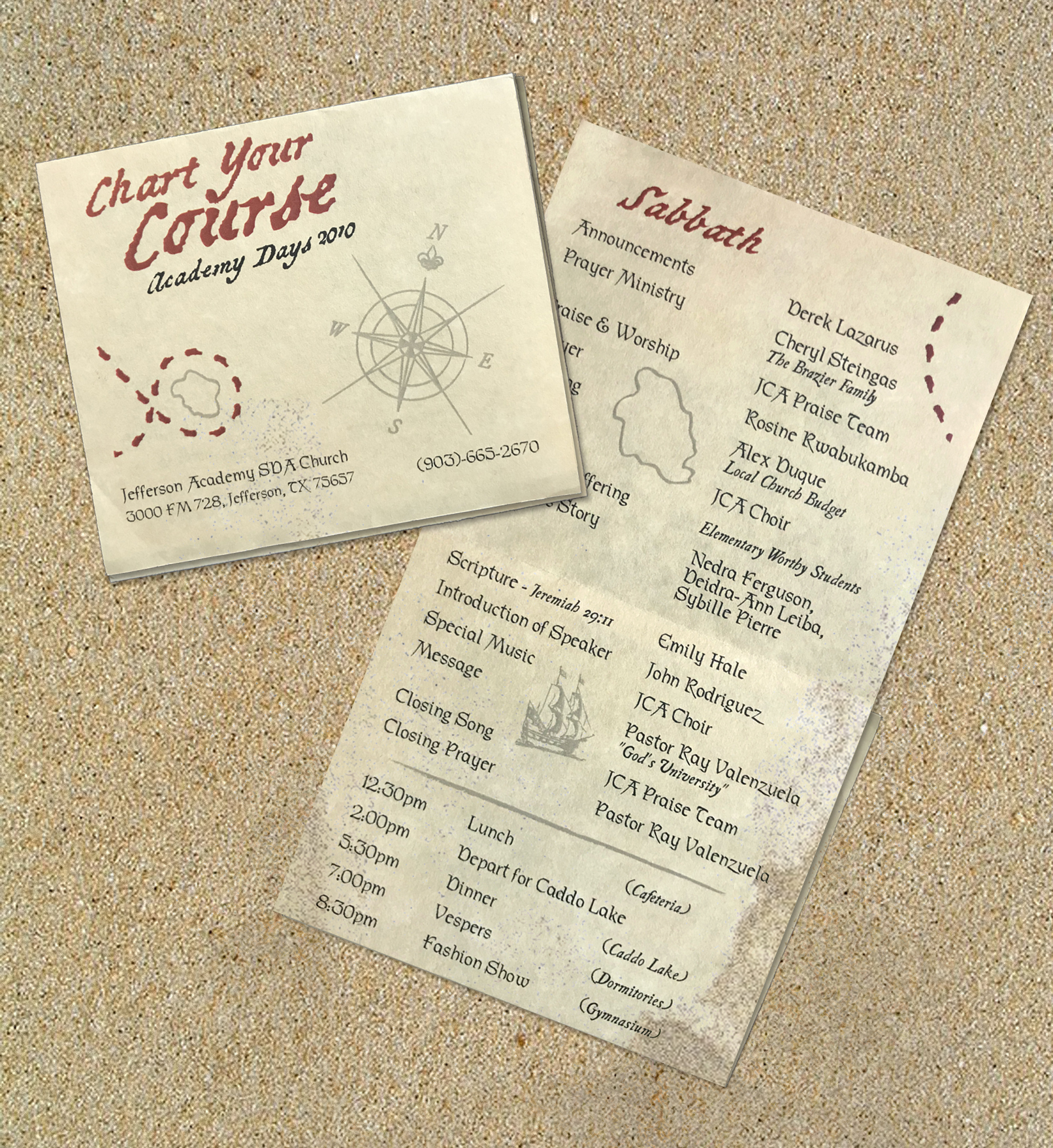
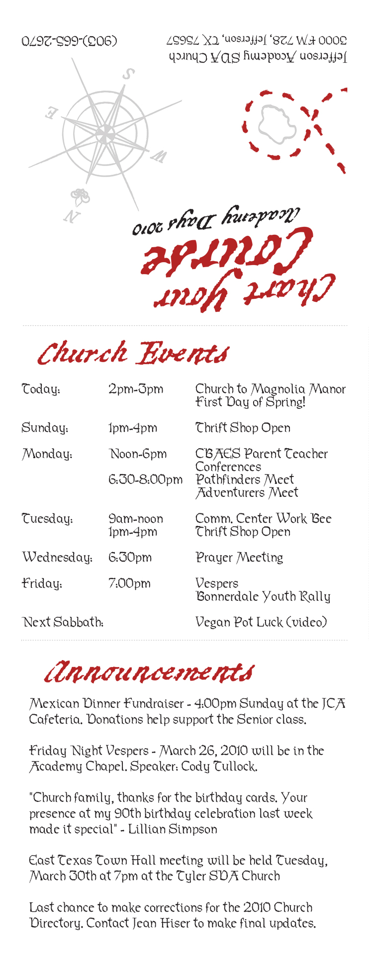
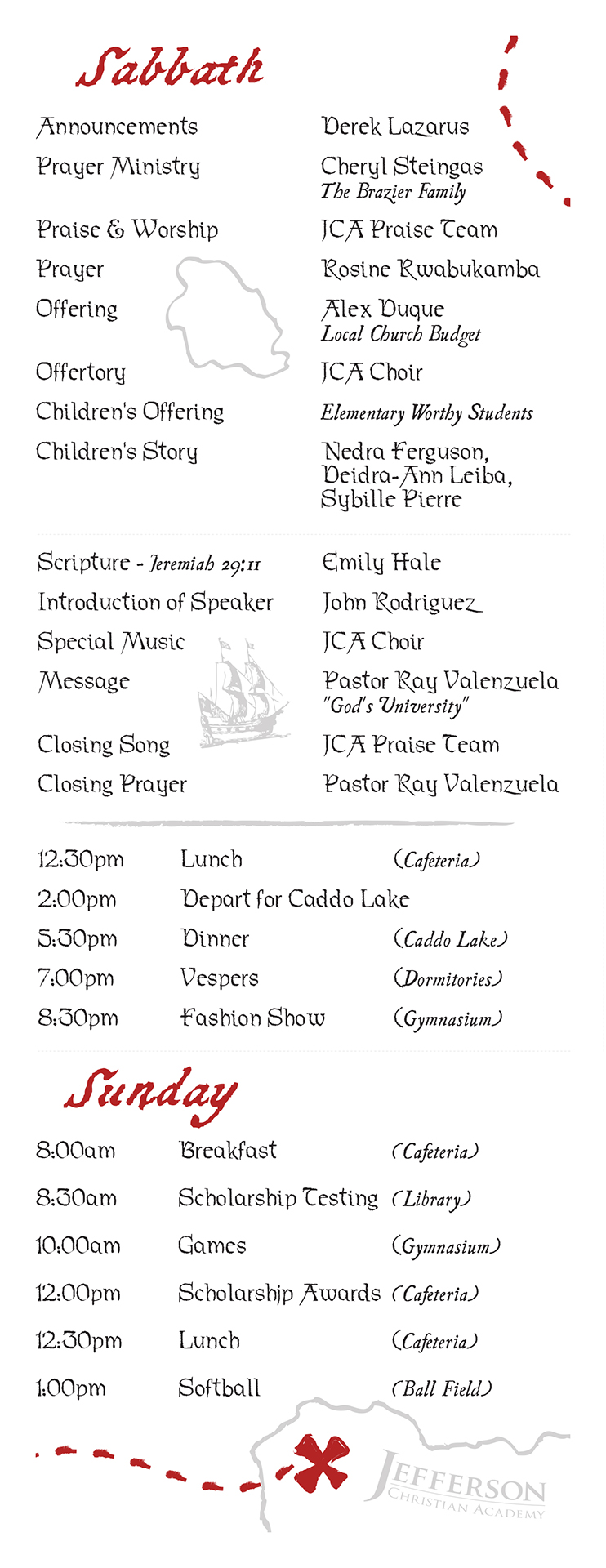
The main schedule was printed as a single-sided narrow design that could fit 3-up on a standard 8.5×11 page. They were rolled up like a mini pocket-sized treasure map scroll for added fun. The full weekend program was also a convenient size and featured a 3-fold layout that would fit in a shirt pocket. Printing 2-up on inexpensive parchment-style resume paper stock helped add a lot of value to what was otherwise a simple design.
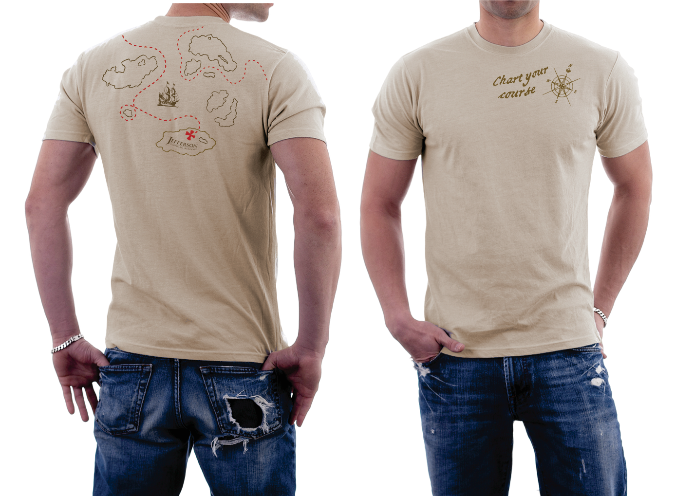
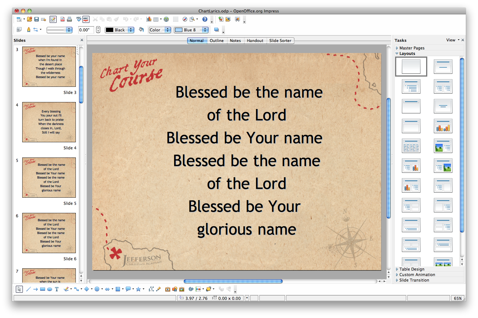
The event T-shirts were printed at a local shop with that worked with me to get the screen as close to the garment seams as possible. I also created a slide deck with templates for welcome screens, announcements, and song lyrics.
